科学的図解のリデザイン
プロンプト
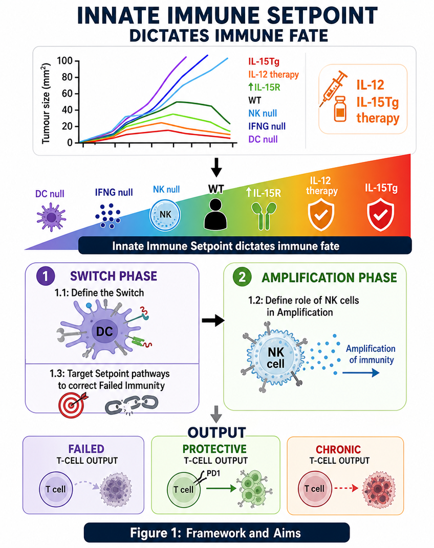
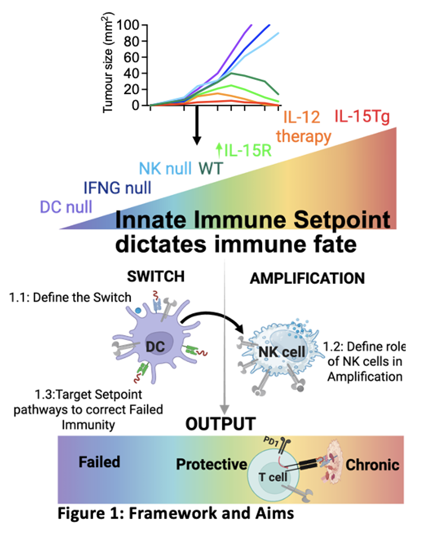
Redesign this scientific diagram to be more visually impactful and easier to understand for a general audience. Use a clean modern layout, clear bold headings, distinct color-coded phases (switch phase, amplification phase), and simple icons or visual arrows to show the flow. Keep all the original scientific content and labels (innate immune setpoint, IL-12/IL-15Tg therapy, failed T-cell output, protective T-cell output, chronic T-cell output) but make it look like a polished infographic with better spacing, contrast, and readability.
似た作品